Problem
Every map looked different, with no shared visual language across designers.
How I solved it
I created a 9-section system covering colour, illustration, icons, typography, legends, composition, texture, logos and handoff checklist.
Overview
One map. Everything your ticket unlocks. Now you have a clear idea of where you’ll go and the fun stuff to do there.
That's what a Headout map is supposed to do — and the map design system is what makes it possible at scale.
Some awesome maps made so far
Problems
Every map looked different, with no shared visual language across designers.
I created a 9-section system covering colour, illustration, icons, typography, legends, composition, texture, logos and handoff checklist.
Designers were spending 3–5 days building each map from scratch.
I introduced reusable components, a structured starting frame and a pre-handoff checklist, reducing production time to 1 day.
The growing map backlog made consistency and scalability increasingly difficult.
The system now supports 250+ maps across LFC, DEX, routes, areas, floor plans, theme parks, nature trails, etc.
The journey
It was all about trial and error — tried hundreds of combinations — before I could confidently engrave anything on stone.
This section covers layer order, spacing, redundancy, legibility and marker numbering before every map shipped.
Impact
I also wrote a blog about it on
the Headout studio, go read!
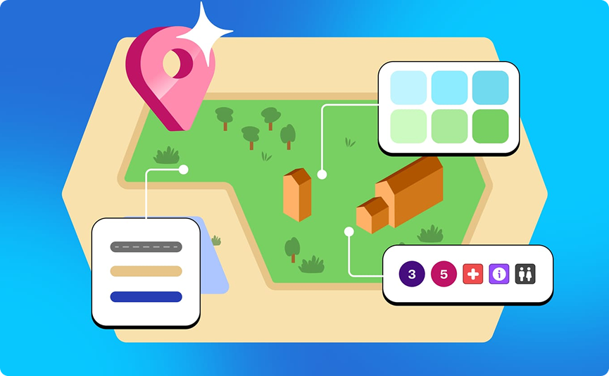
Subproject: Dex maps
They show users exactly where they are within a POI, checkpoint by checkpoint.
There was no single reference for every room and floor, while adding more architectural detail meant cluttered navigation. So I made some rules -
Impact
Dex maps currently live (!!!)